
Golden Breeze
MUSIC FESTIVAL
Golden Breeze
MUSIC FESTIVAL
Golden Breeze
MUSIC FESTIVAL
Client
Advertising Design
Project
Deliverables
Wild Postings
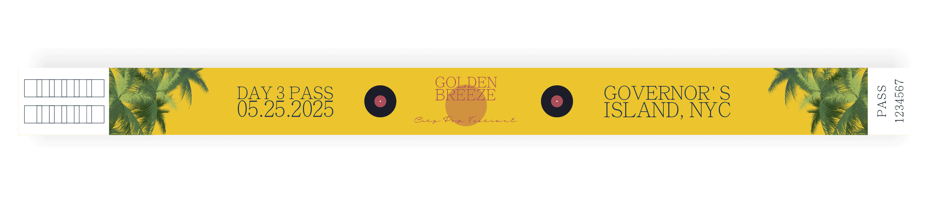
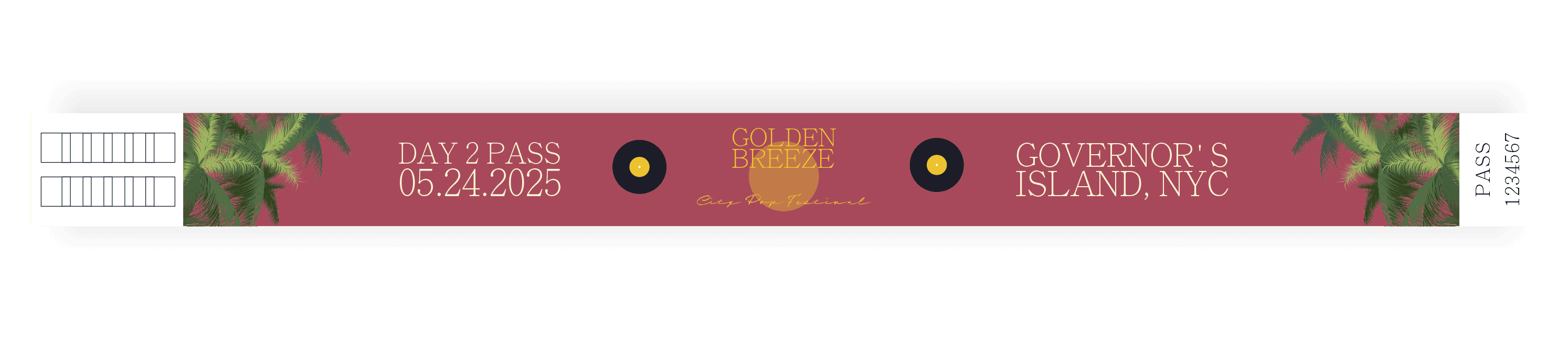
Wristbands
Tote BagWild Postings
Wristbands
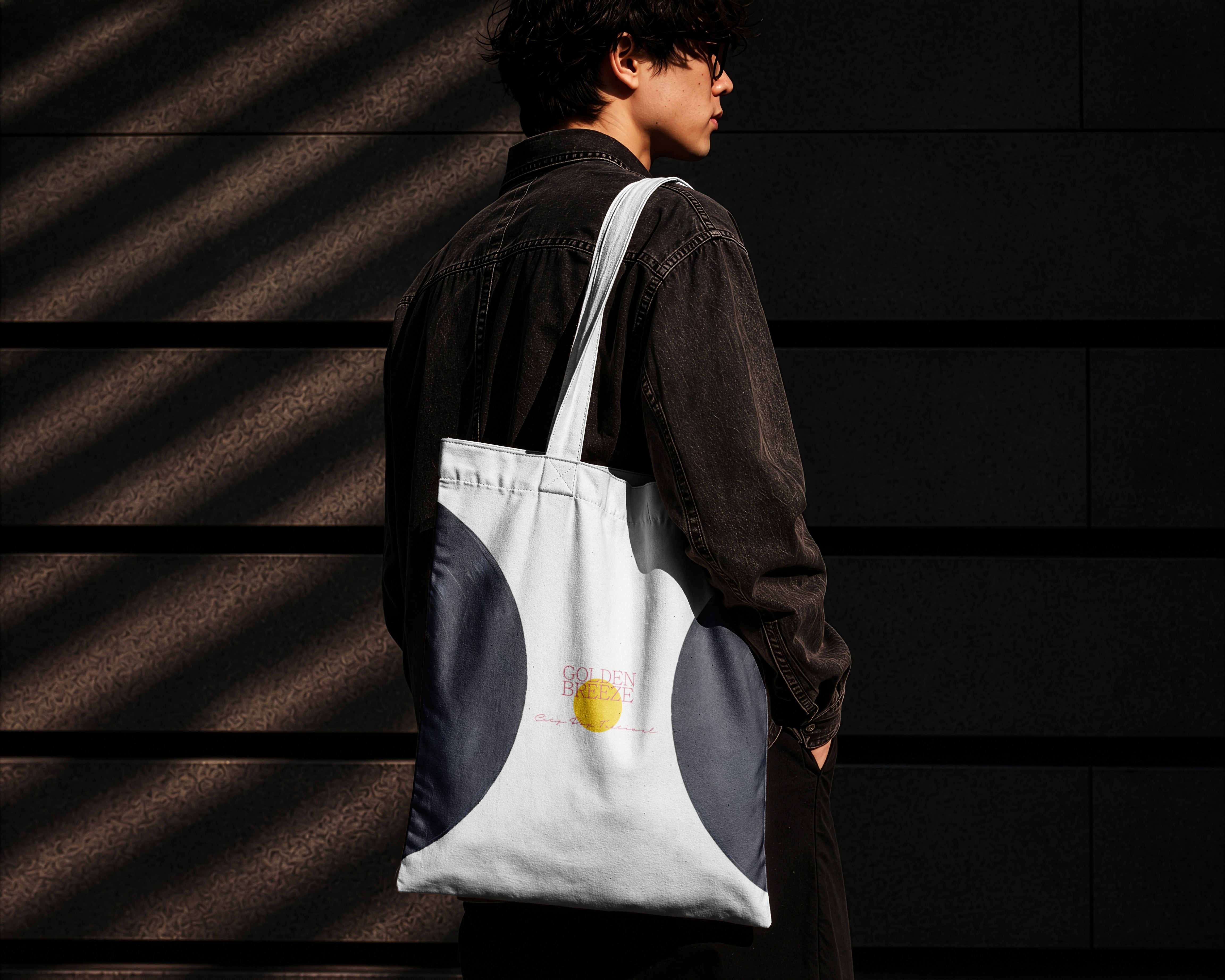
Tote Bag
Tools
Illustrator
Photoshop
Disciplines
Brand Identity
Packaging Design
INTRO
Golden Breeze is a city pop festival inspired by the visual culture and atmosphere of 1970s-80s Japan. The festival brings together legendary City Pop artists and musicians reviving the genre, creating an experience that combines Tokyo nightlife with an oceanside summer escape. The visual identity was designed to capture this feeling of nostalgia , summer, and escapism. I drew inspiration from City Pop album covers, vintage advertising, and the works of Hiroshi Nagai, translating these influences into a cohesive festival brand.
INTRO
Golden Breeze is a city pop festival inspired by the visual culture and atmosphere of 1970s-80s Japan. The festival brings together legendary City Pop artists and musicians reviving the genre, creating an experience that combines Tokyo nightlife with an oceanside summer escape. The visual identity was designed to capture this feeling of nostalgia , summer, and escapism. I drew inspiration from City Pop album covers, vintage advertising, and the works of Hiroshi Nagai, translating these influences into a cohesive festival brand.
Client
Advertising Design
Project
Client
Advertising Design
Project
Deliverables
Wild Postings
Wristbands
Tote Bag
Deliverables
Wild Postings
Wristbands
Tote Bag
Tools
Illustrator
Photoshop
Tools
Illustrator
Photoshop
Disciplines
Brand Identity
Packaging Design
Disciplines
Brand Identity
Packaging Design

THE DESIGN SYSTEM
The palette of warm colors evoke the setting sun and summer heat, while the blues create the feeling of an ocean and evening sky. The visual language draws from recurring imagery associated with the City Pop aesthetic: palm trees, Tokyo-inspired cityscapes, vintage cars, vinyl records, golden sunsets, and even the use in contrasting typefaces. These elements work together to create a visual world that feels simultaneously urban, nostalgic, and coastal. The contrast between the two typefaces creates a balance between nostalgic sophistication and playful summer energy.
THE DESIGN SYSTEM
The palette of warm colors evoke the setting sun and summer heat, while the blues create the feeling of an ocean and evening sky. The visual language draws from recurring imagery associated with the City Pop aesthetic: palm trees, Tokyo-inspired cityscapes, vintage cars, vinyl records, golden sunsets, and even the use in contrasting typefaces. These elements work together to create a visual world that feels simultaneously urban, nostalgic, and coastal. The contrast between the two typefaces creates a balance between nostalgic sophistication and playful summer energy.


Let's work together &
make something beautiful!
Let's work together &
make something beautiful!
Let's work together &
make something beautiful!